Hello everyone! Here we summarised the key creatives by us, WordCamp Asia 2023 design team. We also included some behind-the-scenes stories, so we hope you enjoy reading it. At the end of the article, we also made several recommendations to improve the design work of the next WordCamp Asia design team members. If you’re interested in the work of the design team, you should definitely apply to be the organiser of the next WordCamp Asia 2024 Taipei!
Logo
Designers in charge: Witt, Junko
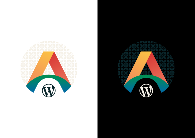
WordCamp Asia 2023’s design journey started from here.
Back in April 2019, WordCamp Asia 2020 design team started with three members, Witt, Junko and Daiya. The first design we tackled was this logo. We spent April – July 2019 to finalise the logo after Nao urged Witt not to postpone finalising the logo design. Witt might have wanted to keep improving the design for a longer time.
Daiya personally remembers having created a logo draft with iPad on his way back from the 2019 WCEU in Berlin. Well, his draft didn’t meet the satisfactory criteria set by Witt at all, and went to the trash box. At last, Witt and Junko’s concepts and ideas resulted in this great logo.
At future WordCamp Asia, design team members can rely on this logo design, but can change the colours and background patterns to have different styled logos.
You can check the story behind the logo design in this post.
Design system
Designer in charge: Witt
After the logo design, Witt chose the fonts and colours to use to create a consistent look and feel across all designs including featured images, website, screens and printed materials.
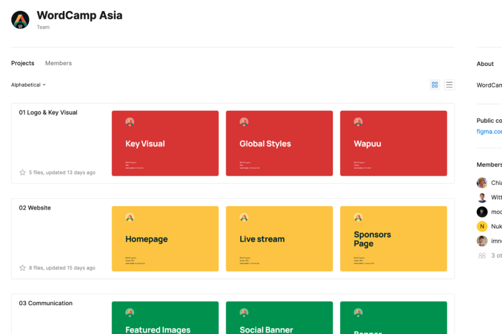
We used “Figma” as our primary design tool, and it facilitated the design workflow for sharing, collaborating, editing and approval. Setting up the selected fonts and colors on Figma as a design system eliminated the hassle of having each design team member to look for the specified design styles, making the design work process much smoother.
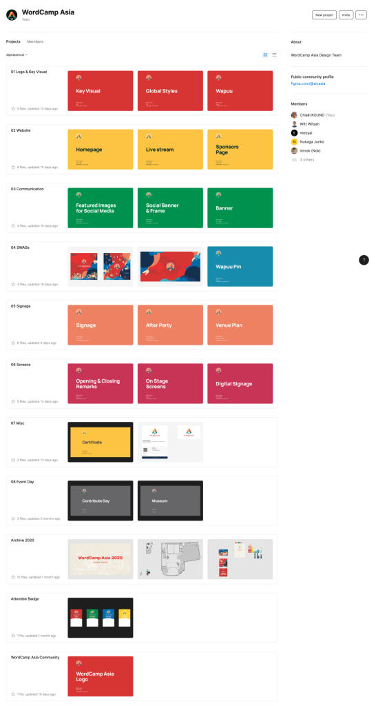


Not only the design style (fonts and colours) but any items to use in designing (logo, key visual elements, sponsor logos, speaker photos, etc) were created on Figma as components and styles in Team Library, and design team members could utilise them as design item “Instances” on Figma without looking for ai/psd/jpg/png files etc in the design process.
This effective design process was largely attributed to Figma and Witt, an experienced and knowledgeable Figma user.
Key visual
Designers in charge: Witt, Biyoke
Did you like the key visual which welcomed you at the venue? It was the brilliant work by Witt and Thai illustrator Biyoke Madavisid (Ying).
The design work of key visuals started in Aug 2019 and was supposed to be completed around Nov 2019 in the original schedule.
Firstly the cloud & liquid shaped (any shapes you can name on it) blobs were introduced in Nov 2019 and you can find them in the featured image of this post. https://asia.wordcamp.org/2020/announcing-our-speakers-round-1-development-talks/ Posted on 29 November 2019.
We had to wait for the completion of the key visual including the illustration of several attendees from various Asian countries and Thai iconic landmarks such as Wat Arun temple, ICONSIAM until Jan 2020, only one month before the event day.
Logo, Design system and Key visual. These three were the starting point of all design derivatives you saw at the venue, website and social media.
From now, let’s look at each design derivative work we created.
Featured images
Designers in charge:
2023: Chiaki, Witt, Junko, Julian, Mooyai, Daiya
2020: Daiya, Witt, Junko
Thanks to the Figma design system provided by Witt, every member of the design team was able to respond smoothly to requests for social media images.
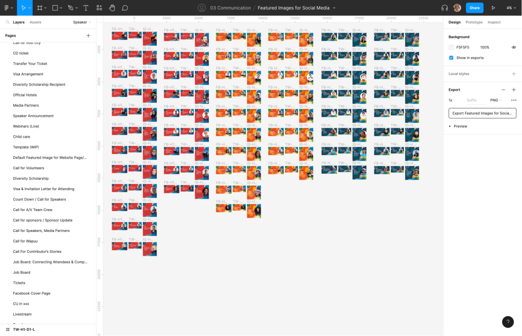
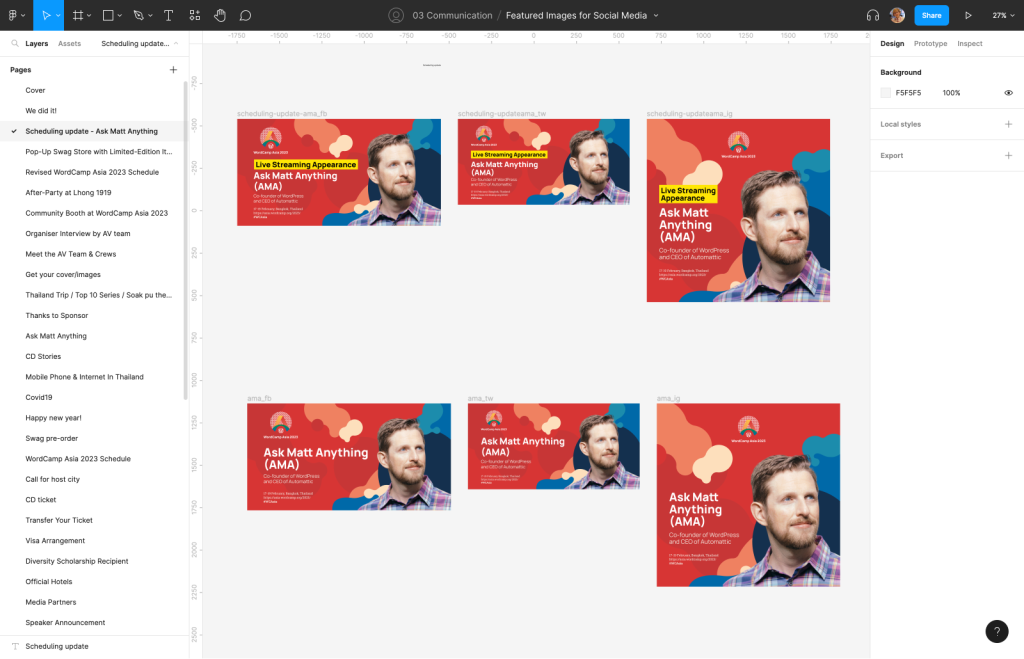
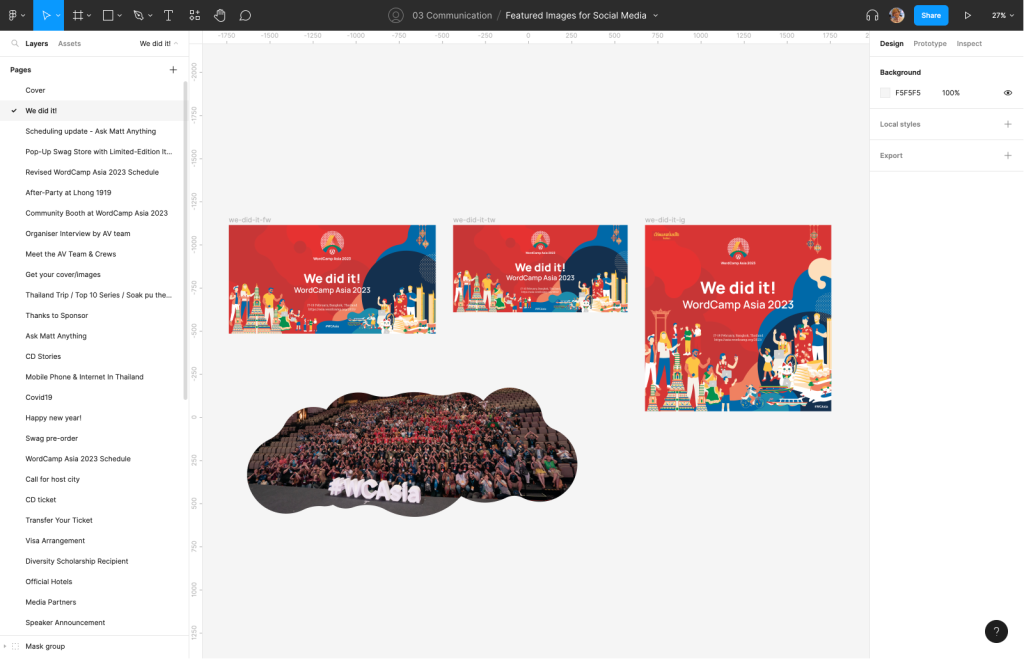
The Design process itself was fine. However, a challenging part was managing the requests for the featured images from different teams and members. Considering this, Chiaki prepared the following request format to accept the featured/social images in the early stage when the team kicked off in 2023.
She believed that this request format would free her from requests with unknown due dates, and ambiguous requests lacking titles/contexts without having to ask for detailed information in reply. Yes, she believed so at that time.
Featured images request template
When you request the design team for a featured image, please make your request on the design team slack channel with the following information.
It would be great if the request was made at least a week or so in advance before your due date.
- Date to be published:
- Title or words to be included:
- specific icons or images (if any):
- URL of your post draft on Google Doc(if any):
- Other requests:
We will be as flexible as possible when changes occur after your initial request.
Thank you!
The request format was shared at the whole team meeting and in the organisers’ internal blog “P2”. However, it always takes time to make such requests well informed among many members. When other teams made social image requests for the first time, most of them forgot or did not notice such request formats existed. For this reason, the design team members patiently & repeatedly copied and pasted the request format to make it familiar even among the other team every time upon the receipt of ambiguous requests in replies.
On the other hand, the marketing team updated the blog/social posting schedule spreadsheet. The design team could refer to it, and prepare for featured/social image requests in advance. But things do not always go as expected. Titles changed several times until just before publishing the posts. Many sudden & urgent requests came with short notice. For one blog post, we prepared one featured image and three social images (FB, TW, IG) as one set. However, not all blog posts needed social images, and several social images were not required as a result.
Alright, can you guess how many featured / social images we created?
… it was 419 images. Then, 361 images were used among them.
Number of images for 2023:
- Created: 419
- Used: 361 (86% of usage) 146(Tweet), 23 (YouTube), 119 (Facebook), 73 (I.G.)
Every team had to organise and coordinate a great deal of information to prepare the content and information to share. So we cannot avoid sudden changes and unused images. The design team simply tried to flexibly support every team to dispatch the necessary information. Design team members need the motivation to enjoy such a situation as fun and get through it leaving never-used images behind.
Website Design
Designers in charge: Julian, Witt
The website design was led by Julian collaborated with the website team.
As the event date approached, we asked Kharis from the website team to update the website so often. We really appreciate him for answering our multiple requests in a timely manner.
Attendee’s Batches
Designers in charge:
2023: Vachan
2020: Chiaki
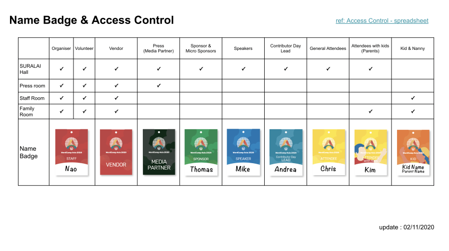
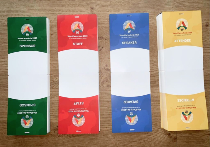
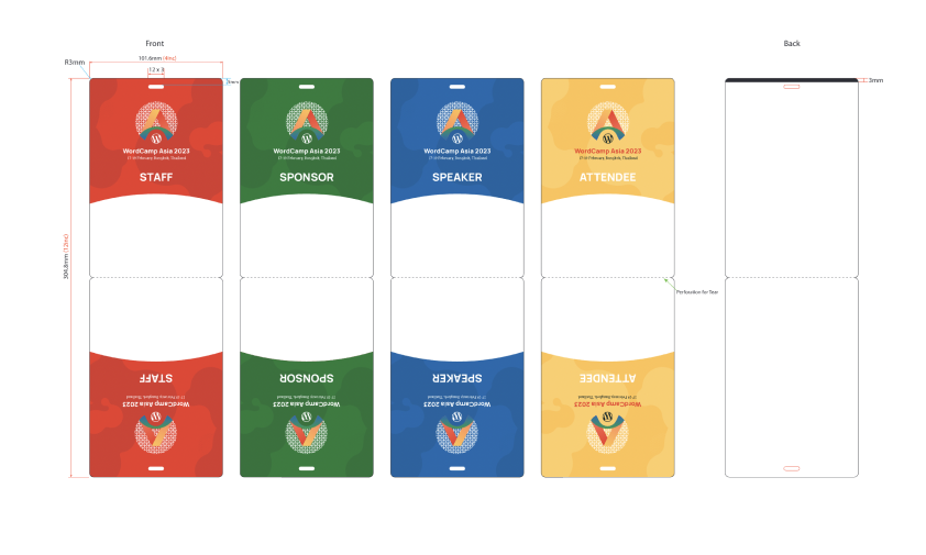
Chiaki worked on the attendees’ batches for 2020, and Vachan succeeded it for 2023. This work consisted of badge design itself and ticket management & printing vendor selection.
“EventNook” had been selected to use as our registration process.
Nana Booth
Designers in charge: Junko
The sponsor booth design for the Nana tier was provided by the design team. This design was prepared by Junko.
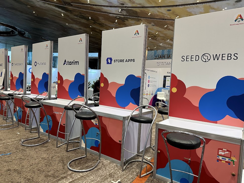
Junko was caught in a dilemma between the sponsor team asking for booth design & specification and insufficient information from the local team to prepare booth design. This might be tough for her compared with the designing process itself.
Venue Signages
Designers in charge: Mooyai, Junko, Witt
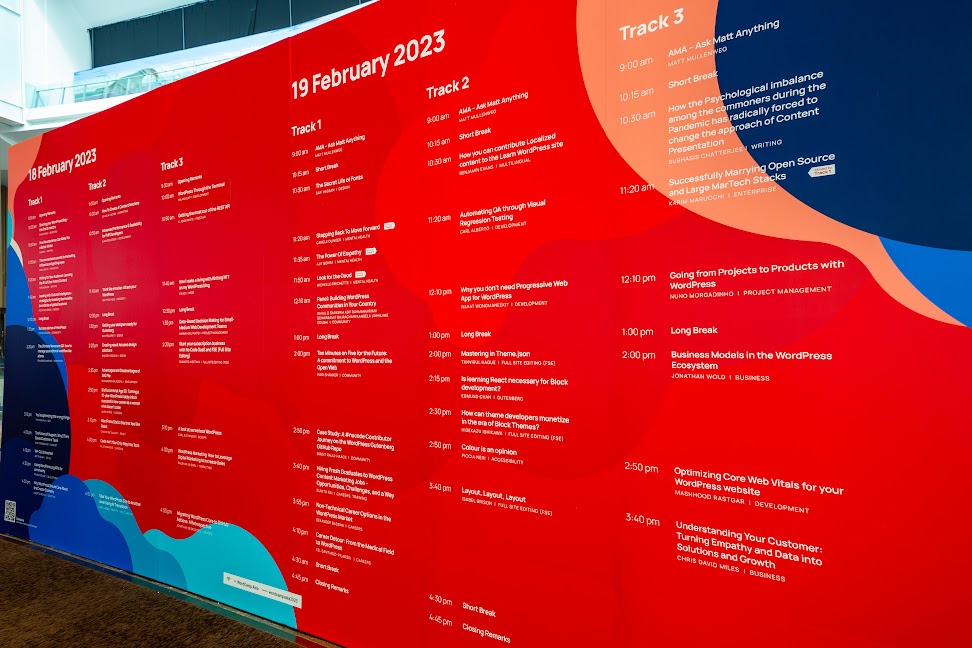
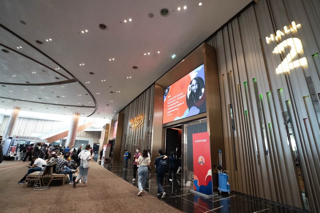
Venue Signages’ preparation status for 2020 was so disastrous. Even 3 weeks before the event date, we were not sure which signages and how many were necessary to design and prepare. Unless WordCamp Asia 2020 was cancelled 10 days before the event date, you might not have seen signages as you saw at ICONSIAM this year 2023.
In 2023, we were so optimistic because all necessary design materials like Key visual were ready 3 years ago and we had Mooyai, a Thai local designer, for venue signages.
The big issue we faced in 2020 was that we could not promptly identify the necessary signages which required the site visiting and/or close communication with the local team to get the necessary information. Considering this, having a local designer for venue signage design was a big advantage for the smooth preparation.
In addition, what relieved us most for venue signage preparation was that Mooyai smiled and said “Printing due date passed today” at the meeting despite not having placed the printing order yet. Afterwards, the venue signage turned out to be perfect on the event date. Wow, this was the magic by Mooyai, the Local team and the Production vendor.
The venue signage work did not finish by the event date. We did notice and face the issues to solve even on the event date. Let’s take one example. When distributing lunch on contributor day, Devin noticed that we had no signage for “non-preference” lunch boxes despite having ones for halal, kosher & vegetarian.
A few minutes later, Mooyai showed up with A4 printed signage reading “non-preference”, and solved the issue.
Well, in order to tackle these issues, the Local team brought a printer machine to the venue, Mooyai designed and printed the necessary signages on demand even on the event days.
Contributor day
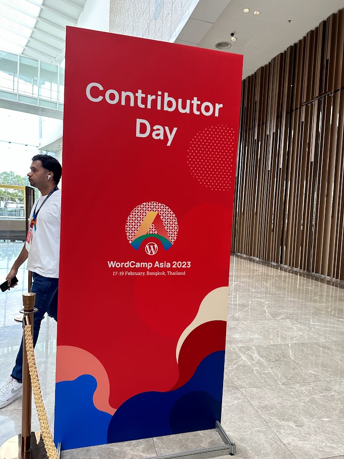
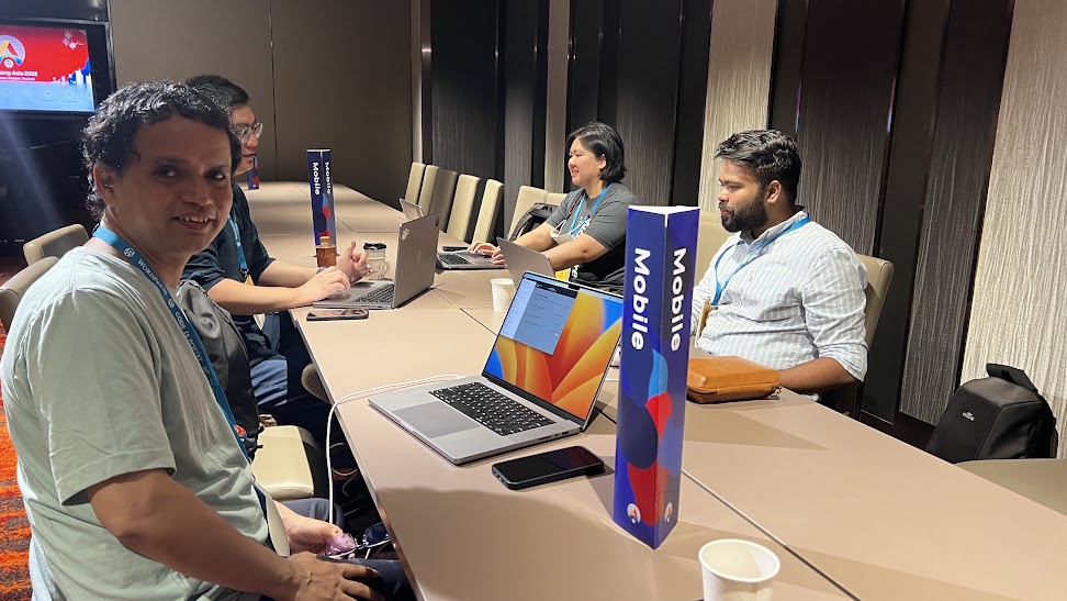
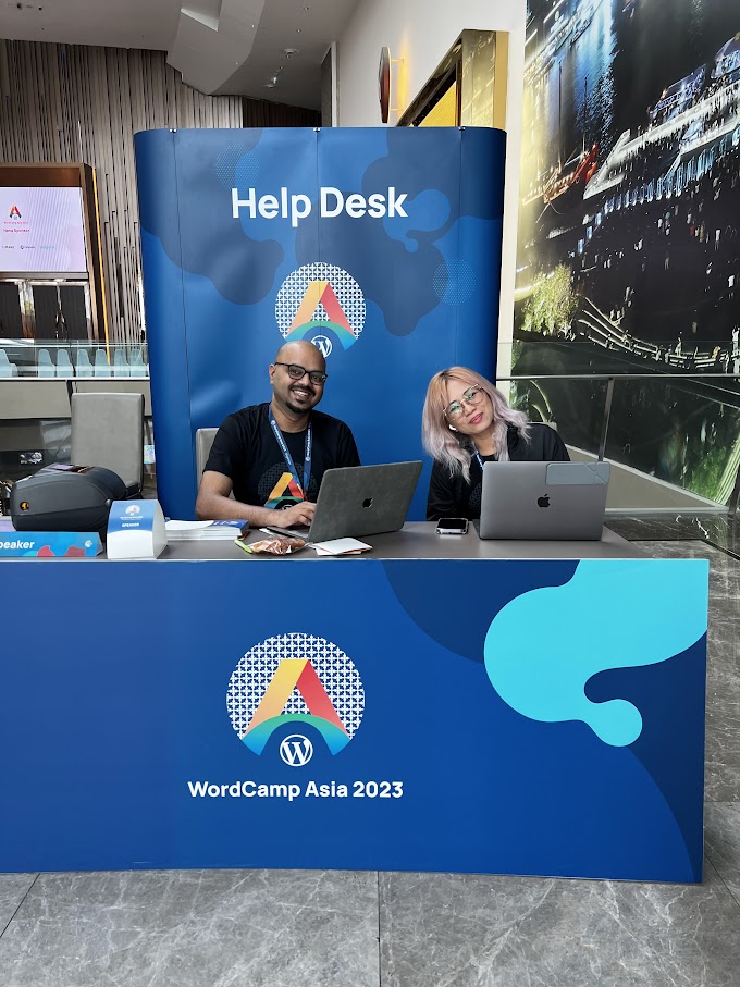
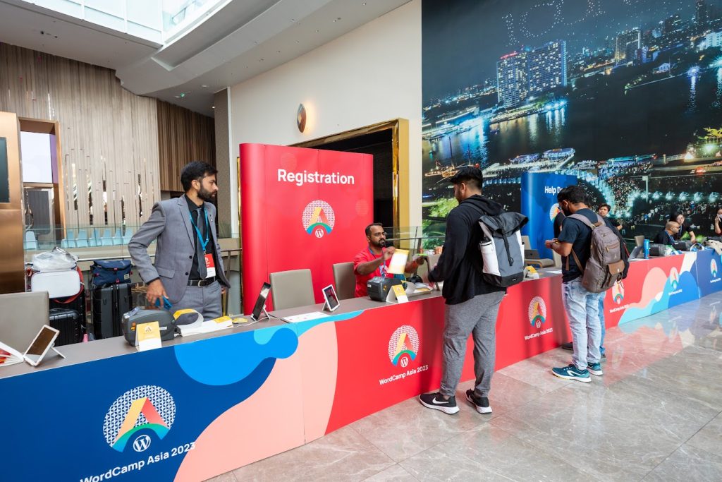
Registration & Help desk
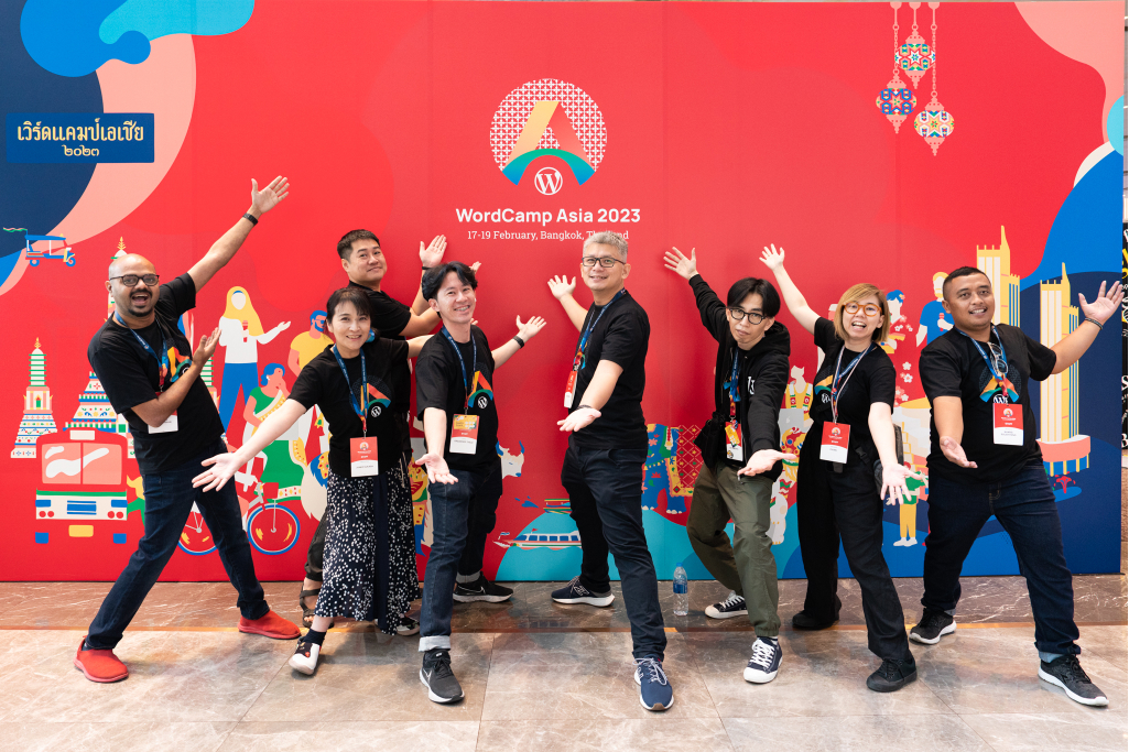
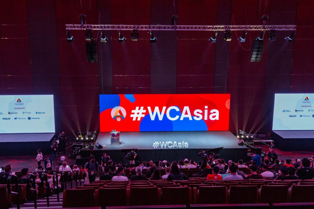
Main Backdrop
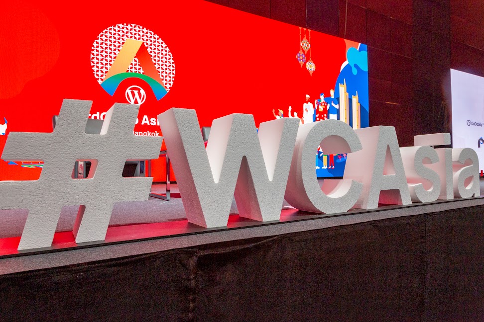
Stage Letters
Stage letters made of foam cutting, which we’d seen at WCEU, were also created for WCAsia. As it was lightweight, we could reuse it by carrying it from ICONSIAM to the after-party venue. Very good idea!
And many more!
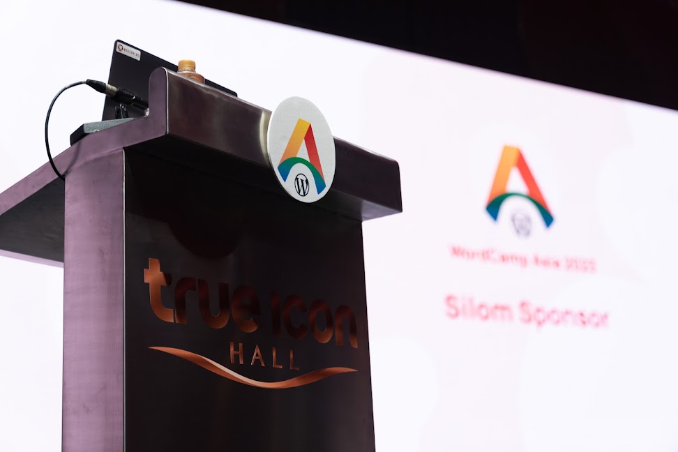
Many other items were also created. For example, the WordCamp Asia logo made of printed foam board was attached to the speaker table.
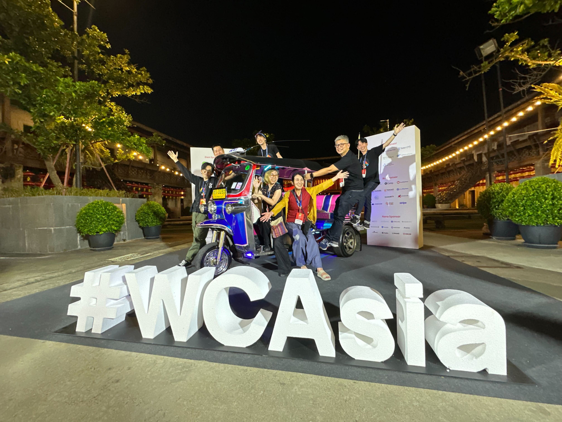
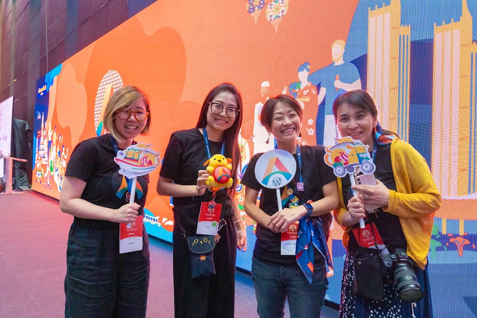
Mooyai and Witt also created a handy foam board with the logo and Wapuu with the stick for the souvenir photo. These hand-held foam boards were also available on the tuk-tuk set up at the after-party venue. Did you enjoy taking funny and nice photos with them?
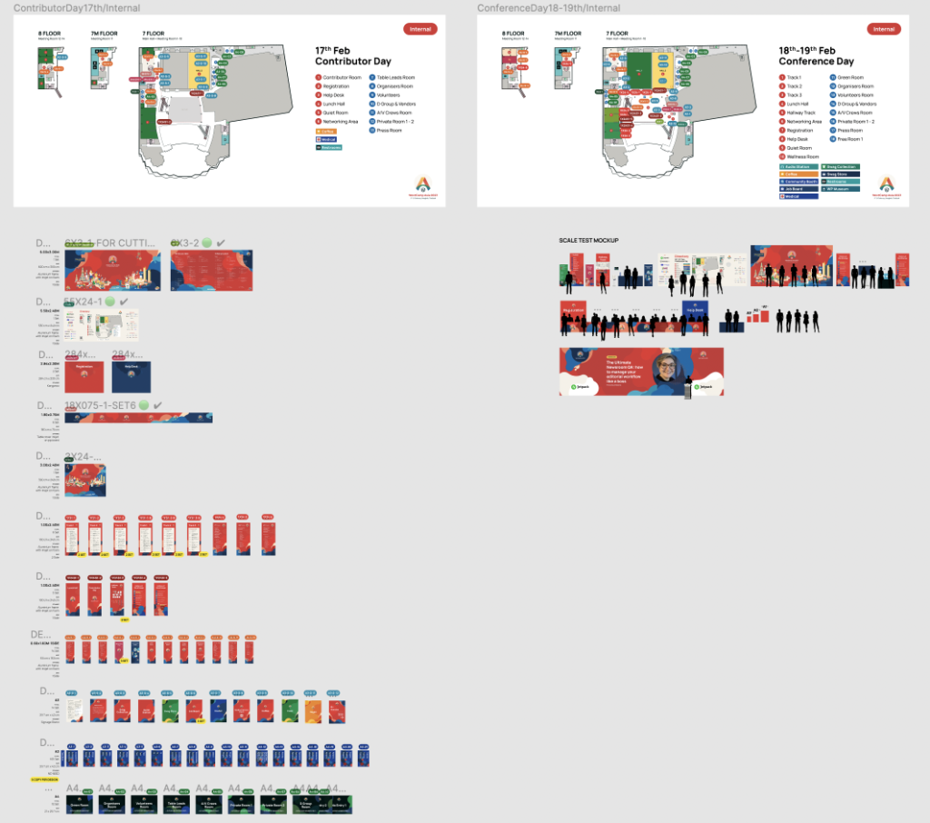
Figma data of the Venue signage
Want to see the design file for venue signage?
The various venue signage designs can be seen in the Figma data below.
Figma view: https://www.figma.com/file/O4Wus1E4MKfmCCC3MZ81UN/Signage?node-id=317%3A22261&t=HO58en3SFXSPyiWx-1
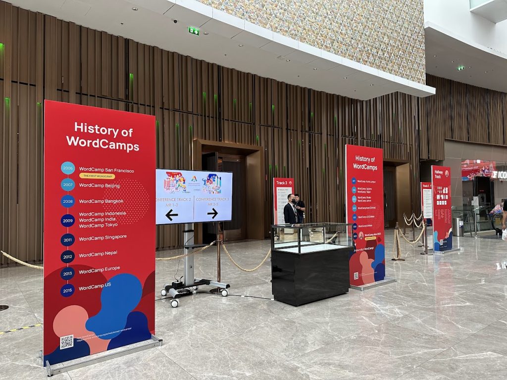
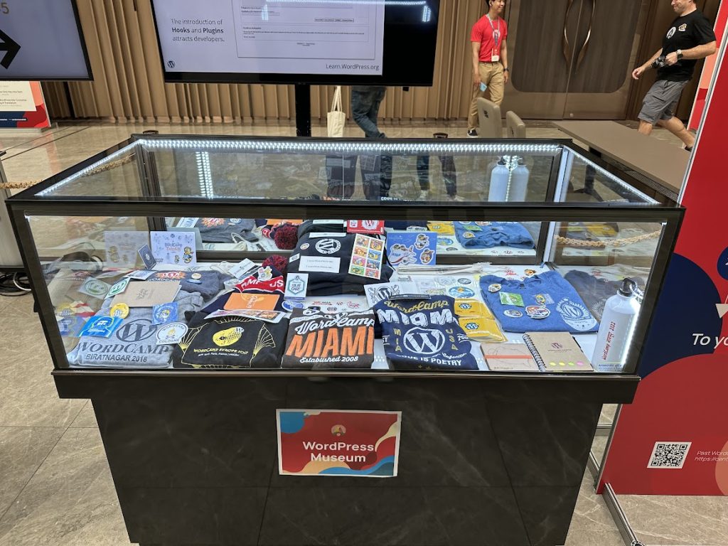
WordPress Museum
Designers in charge: Junko
The panels for WordPress Museum were also prepared by Junko.
We heard some complaints that some WordCamps were not listed or listed in the wrong year. To be honest, we could not spare much time for this. Please overlook these points.
On the other hand, we could hear that some enjoyed this exhibition. Big thanks to Ganga who led this project.
Swag & Items
Designers in charge: Witt
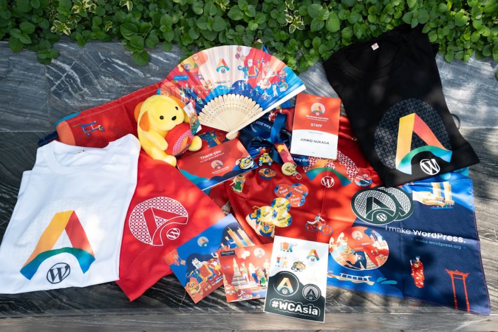
Witt was in charge of most of the Swag design. You can find more information in the other post
Digital Screen Signages
Designers in charge: Julian, Witt
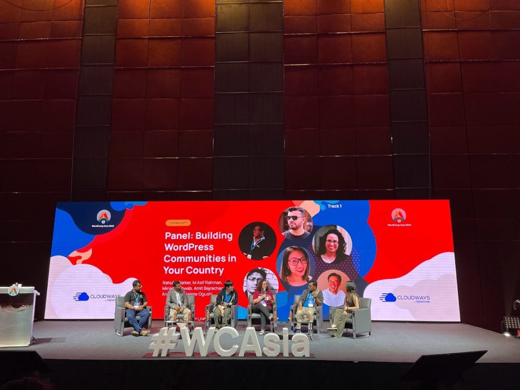
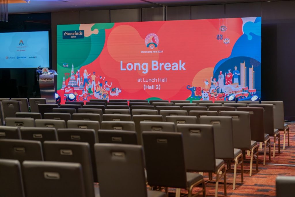
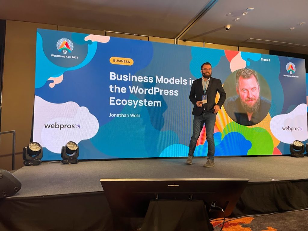
The speaker introduction slides and the information slides for the breaks on such large and huge screens on the stages were all prepared by Julian.
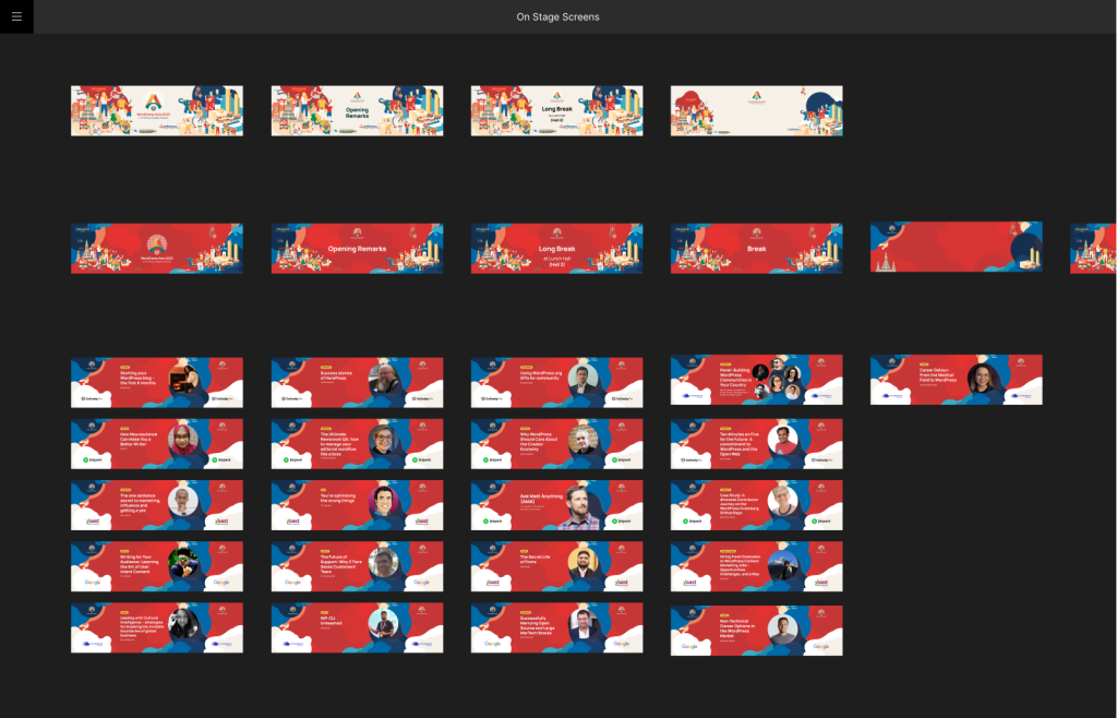
The screen signages are divided into 3 colour schemes – red, orange and dark green & different tiers of sponsors.
As we had so many speakers on the stages, he made over 300 of screen designs for the stage, featured images and WPTV.
The advantage of digital design helped us. During rehearsals, we noticed that one sponsor logo was missing from the slide. But Julian could quickly add it so that we could pass the conference days as if nothing had happened.
Motion clips
Designers in charge: Daiya
Did you see the motion clip with Tuk-tuk Wapuu and Boat Wapuu running across the screen during the break between sessions? That was also by the Design team. We were so glad to hear that this motion clip raised attendees’ expectations and excitement for WordCamp Asia.
Just at the early stage of preparation, Witt murmured that it was good to have the motion graphics at the design team meeting. Yeah, that’s good to have, not must to have. To be honest, Daiya must confess that he just personally wanted to move Wapuu across the large screen. Then we did it this time for 2023, not like 2020 when we had no time allowances for motion clips.
We prepared three motion clips for different screen size ratios, 3072 x 896 pixels for Track 1, 1664 x 640 px for Track 2 & 3, 1920 x 1080 px for the entrance screens at Track 1 & Youtube live streaming.
Although both clips are approx. 2 mins short motion clips consisting of 7 scenes, it took time to create & test new motions (and trashed the half of them), adjust the positions, scales and motion speed of each object one by one respectively in three clips. But it was worth taking a lot of time.
Having said that, the clip of 1920 x 1080 px HD size was created in a very short time after Witt smiled at Daiya with the atmosphere of not-allowing to say no and requested to make it by the evening. That was the busy afternoon of the Contributor day. But luckily Daiya still remembered what type of motions he attached after completing the clips for Track 1 and Track 2 / 3. And he kept the files for the HD size clip created for testing purposes. Thanks to his not having deleted the necessary files, he could have the HD sized motion clip in 4 hours.
The selections and layouts of items in each scene were originally based on the design files (which were created mostly for other purposes than motion clip) created by Witt, Mooyai, Chiaki and Julian. Daiya borrowed other members’ designs and made them active and more attractive by only adding the motions to their positions, rotations and sizes.
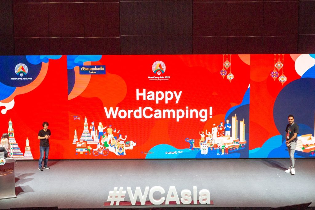
Slides for Opening & Closing remarks
Designers in charge: Chiaki, Junko, Witt
During the Contributor day, we found that the slides for the next day’s opening remarks were not completed. Witt assigned Chiaki to take care of the slide design, then Chiaki wandered the venue to find Nao.
After successfully having found Nao, she received the editor role of the opening remarks slides on Google Slide to discover only minimal outline and simple background design on it. From this time, Chiaki’s whole 3 days of WordCamp Asia started with and was going to end with preparation for slides for Opening & Closing remarks.
Unfortunately, she could not finish the slides by the end of the contributor day despite Daiya finishing the HD sized motion clip next to her. She wanted to continue working on the slides. But she could not because we had the welcome dinner that night. After Chiaki enjoyed the welcome dinner, she returned to the hotel and resumed the slide work. The slide draft was passed to the team leads at 2 am midnight. (this was Chiaki’s own voluntary decision, and the team leads never forced her to do so).
The next morning, the team leads had one last great brush-up from the early morning, and that emotional opening remarks started.
Chiaki could not enjoy the excitement of the opening remarks for so long. Yes, she got a new task, the slides for closing remarks. Of course, it was not completely ready yet. Chiaki carried her own notebook pc and appeared in the various spots of the venue working on slides and hearing the session at the same time for the whole two conference days.
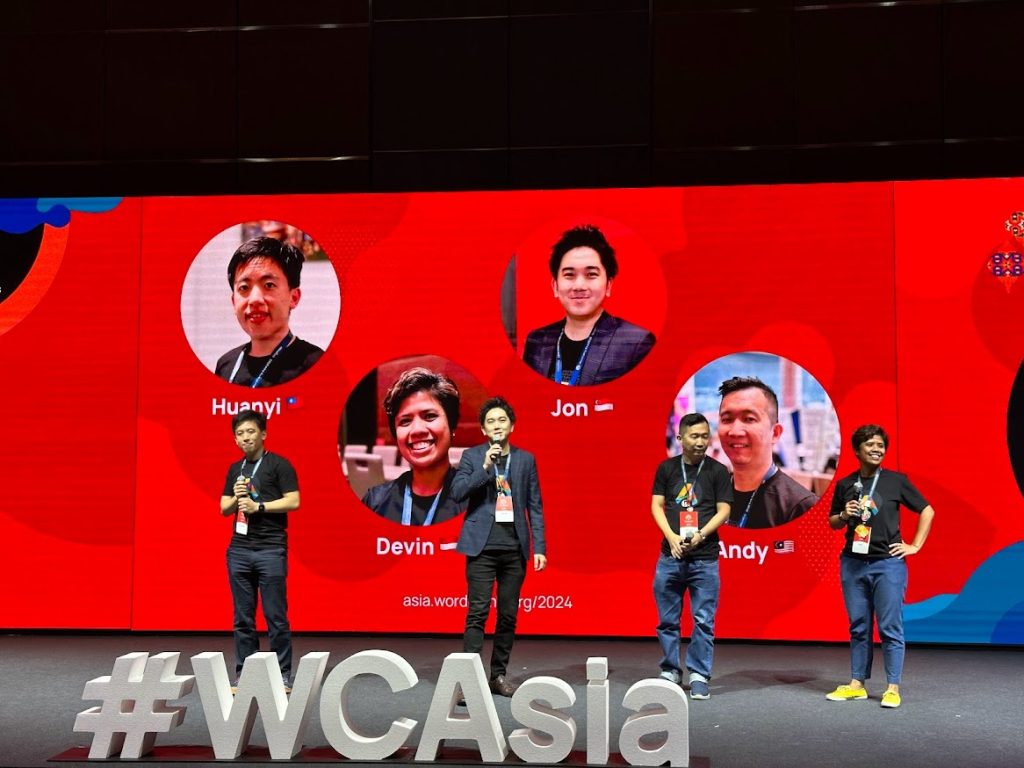
Junko helped with the slide design as well. She took pictures of all the swags on the balcony outside of the venue. Thanks to Junko’s advice, Chiaki improvisationally layouted the profile images of all organisers, contributor day table lead and speakers filling up the slides with them.
The next host city was only known to very limited organisers, and should have been kept secret until the announcement at closing remarks. Junko and Chiaki happened to discover such a top secret in preparing the closing remarks slides. Due to that, they were locked in a very small room for the last two hours and finished the slides (a bit exaggerated).
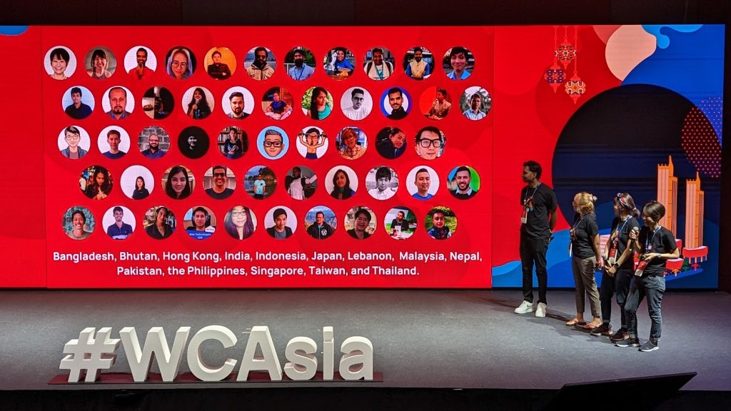
At the last minute, Nao, Sam, Nok, JC, Junko, Shusei and Chiaki, 7 people edited the same slide at the same time… How useful Google Slide is…!
After finalising the statistics and other information, it was only 20 minutes before the closing remarks when we finished the slides.

Waterfall
Designer in charge: Witt
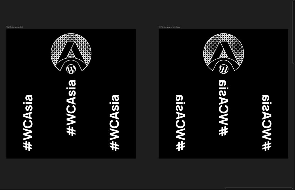
At last, the final item. we bet nobody noticed this design existed at the venue, ICONSIAM.
Did you see the waterfall in front of the sponsor booth? That’s right. We also put the WordCamp Asia logo and hashtag #WCAsia on the waterfall.
You can see it in this movie from 2 min. It might be difficult to see it unless you see it directly with your eyes. Believing is seeing. Can you see it?
Recommendations for next organisers
- Digital design such as websites, social media images, digital signage and digital screens can be handled by non-local members. On the other hand, designs that require orders to be placed with local vendors in the host city, such as swag, t-shirts, signage and backdrops for the venue, should be handled by local members.
- Considering the deadlines for various productions, the deadline for sponsorship applications (payment confirmation) should be two or one and a half months in advance.
- For the design of social media images, each team requested several images in a series. For this reason, within the design team, it may be easier to add variation to the design by assigning a person to be in charge of each team. For example, images related to the Contributor Day Team could be designed by person A, while those related to the Speaker Team could be designed by person B, and so on.
- It is recommended that you have a list of items and signage to keep for your record photographs and ask your AV team to take photographs at the venue to keep them as record.
- If you receive ambiguous requests from other teams, guide them to prepare a clear plan with an approved budget.
Are you ready for WCAsia 2024? Let’s apply!
Are you ready for apply the next WordCamp organiser and join the design team? Apply to be an organiser for WordCamp Asia 2024 Taipei!
Thank you so much for your reading!
